When you build something beautiful, they come.
U.S. Bank
Industry:
Financial Services
My role:
Client leadership and stakeholder alignment, product design and research, design and research oversight
Timeline:
2012–2020 (conception to scaled enterprise platform)
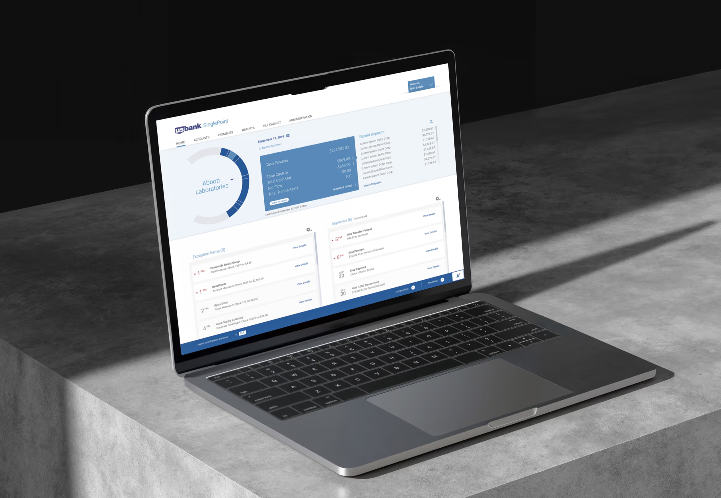
A B2B platform that increased market share by 40% in its first year and scaled across eight business lines. By 2021: $1.9 billion in annual revenue. Fifteen legacy applications retired.
These results were beyond anything I expected. But the bigger success was that the project shifted how B2B products could look and function—proving that comprehensive research and beautiful design not only delight users, they transform business outcomes.
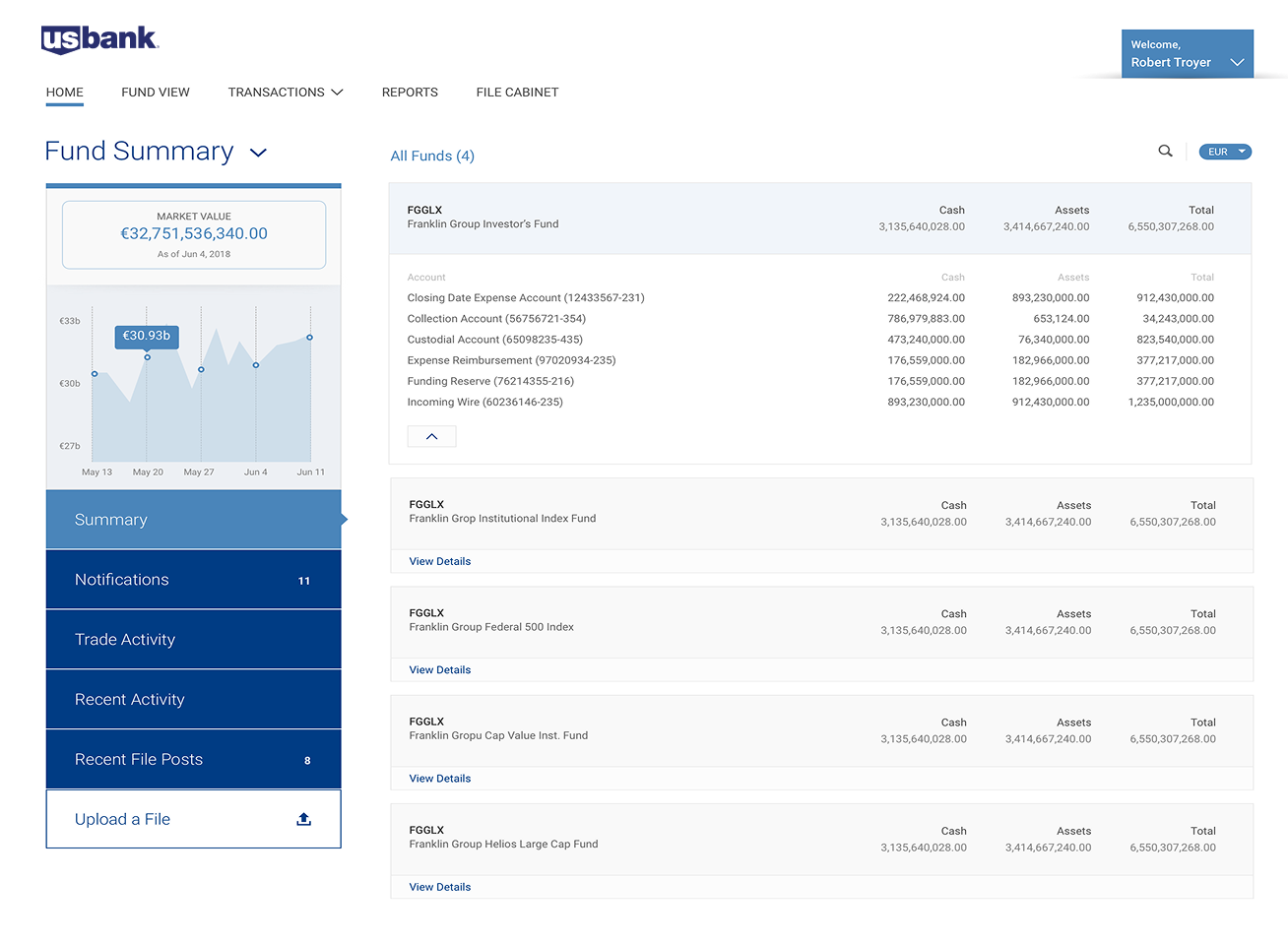
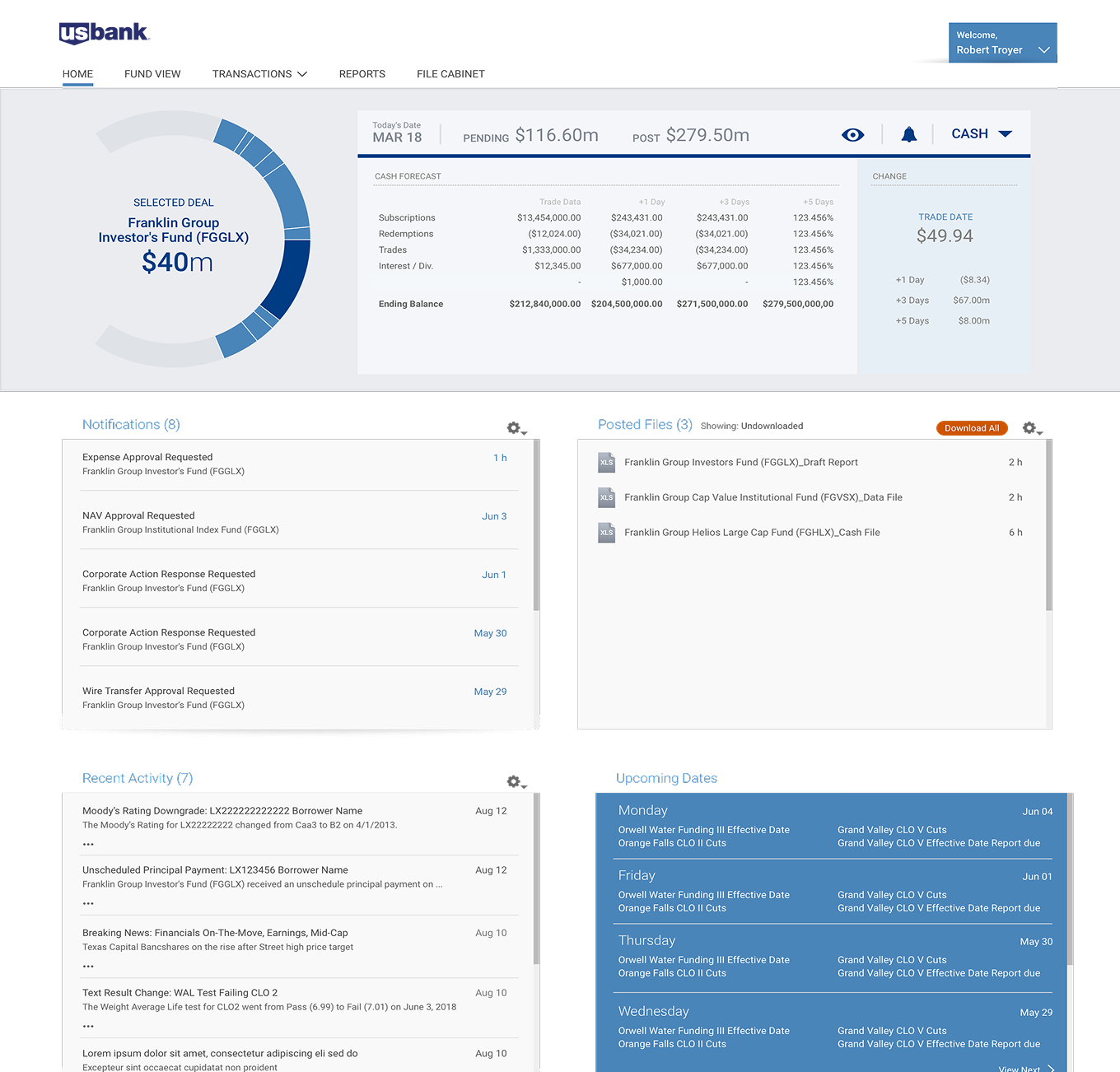
User research was a key factor in our initial success. We cast a wide, covering all eight business lines, to understand the full landscape.
The findings revealed what was unique and shared across different businesses and personas—allowing the product owner to organize the vision into clear themes and phases. For me, it provided the clarity to design something transformative.
Small, thoughtful design choices like this create lasting differentiation. This “wheel” is a functional symbol and it became a proprietary asset that truly resonated with both internal and external clients.
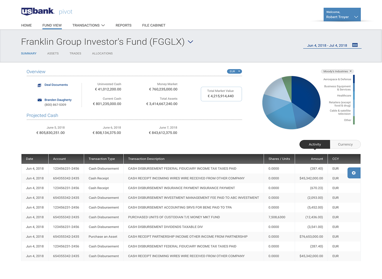
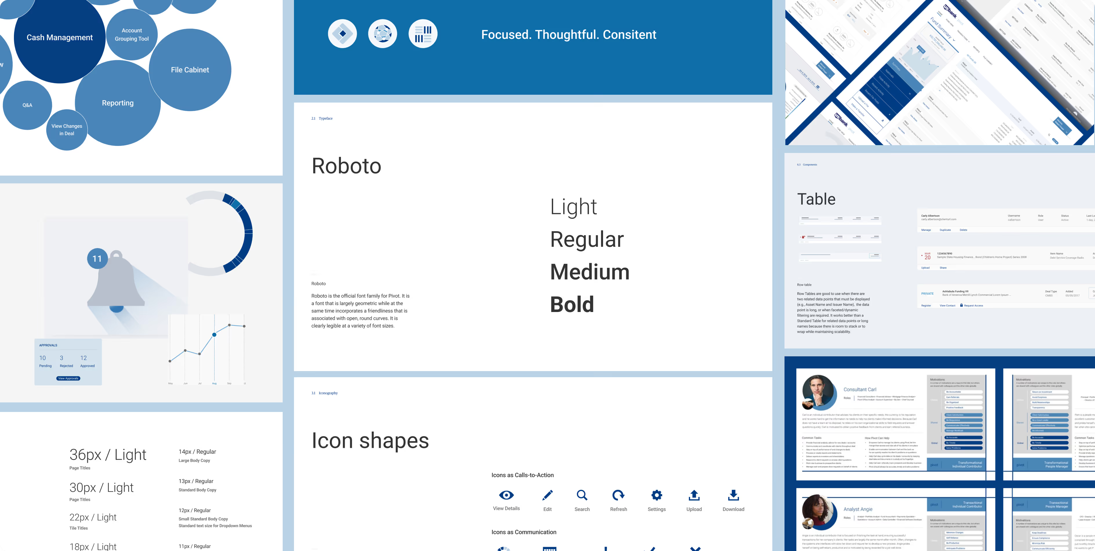
Use of color
Pivot used colors purposefully to communicate how things function. Neutral tones created the foundation, allowing accent colors to establish hierarchy and guide focus—minimizing visual noise while maximizing clarity.
As the system expanded across eight business lines, we stayed anchored to three design principles: focused, thoughtful, consistent.
With the client's support, we conducted research every 8-12 months to stay connected to evolving needs. This continuous engagement made clients feel heard and reinforced that we were serious about building something different. It also helped the team continue to innovate.
“It wasn’t just that the product was successful, but it really transformed our brand’s perception and the market, positioning us as a tech innovator.”
— Bob Troyer
Dual wins. Sizable returns.
The vision that surpassed every expectation.


Holds a special place in my heart.
Projects like this, spanning eight years from inception to enterprise-wide success, are rare. Scaling it across eight business lines, generating billions in revenue a year, supporting millions of users, and setting the new standard for B2B design was truly extraordinary. It was an honor to usher in that shift.