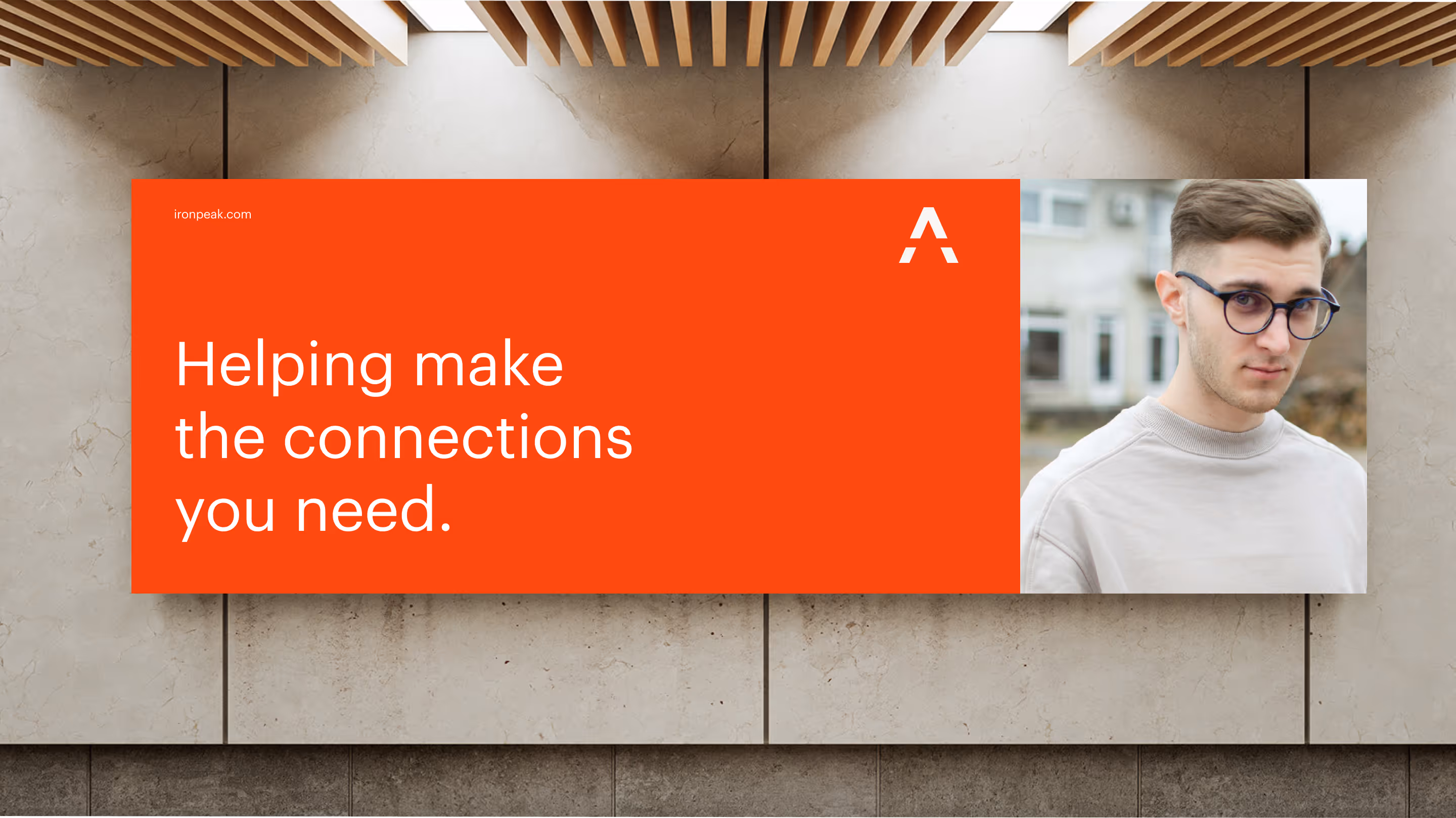
A new name and a new era created the motivation to innovate.

Ironpeak
Industry:
Financial Services
My role:
User research, digital strategy, digital design, and website development
Credits:
Michelle Andreonetti, Matt Huss, Kate Knowles
This insurance network wanted to usher in a new era with a new name and a new visual identity. They also saw this as the right time to “level-up” their digital presence and wanted to do it “the right way”.
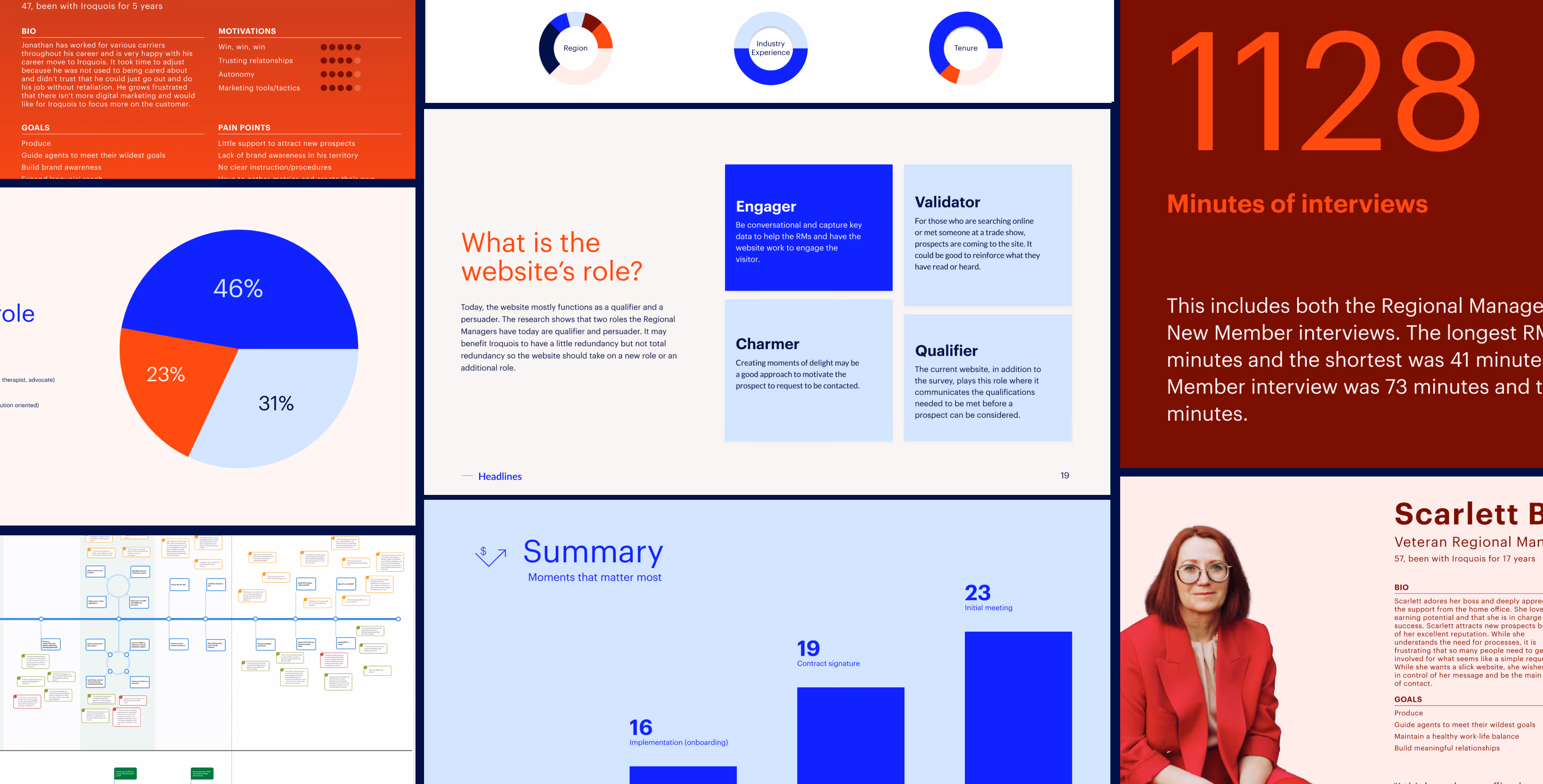
While the executive leadership team aligned on the need for a new visual identity, there was no consensus on the level of investment for the website.


User research was the first step to determine this.
Through the research, I saw that the website did not have a clear role. In fact, it mirrored the sales team's role — sell to prospects and close deals. That's a role it cannot play. Instead it needed to do one thing exceptionally well: engage prospects enough to want a conversation.
That single insight shaped everything that followed.
We translated the visual identity into a digital design system and experience that felt warm and engaging.
Every design decision was made to showcase their network in an engaging way. The technical choices, from semantic markup to subtle animations, reinforced that we were building something everyone could engage with.
Utilizing color themes
To emphasize the brand color, we used tints.
Most websites communicate their value by “boasting,” and that's boring. We chose to be interesting and memorable.
Each region has its own page and the imagery to showcase a deep understanding of each market. The page also has "fun facts" that would make for interesting conversation at a dinner party. There is also a history page that goes all the way back to 1935.
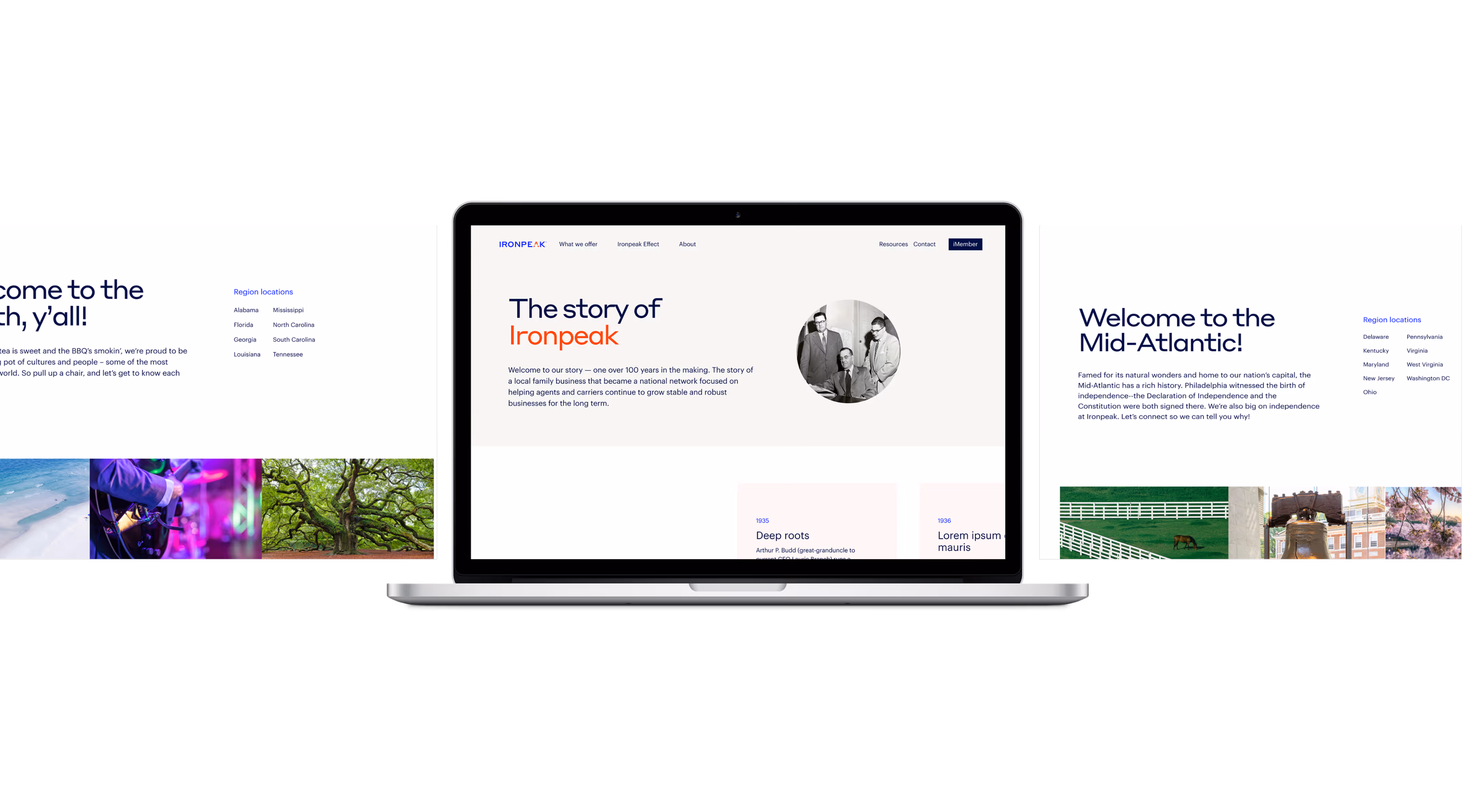
We also focused on giving them a platform built for content management, performance, and accessibility.
“You really hit the mark.”
After launch, a key executive carrier partner reached out and said, “I like that the website engages me. You really hit the mark.“ Bullseye. The exact role I'd defined. The website does exactly what it was designed to do: create the conditions for conversation.